Metaplanet is Japan's first and largest listed Bitcoin treasury company. Our brand is the face of that conviction, so use these assets and rules to keep it clear, confident, and consistent everywhere it appears.
Style "Metaplanet" as a single word with a capitalised M, or in all caps. Do not split it into two words or capitalise the P. This is the rule people get wrong most often.
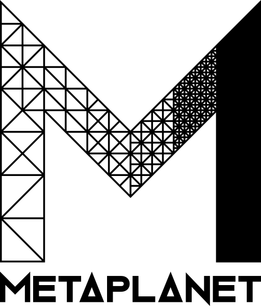
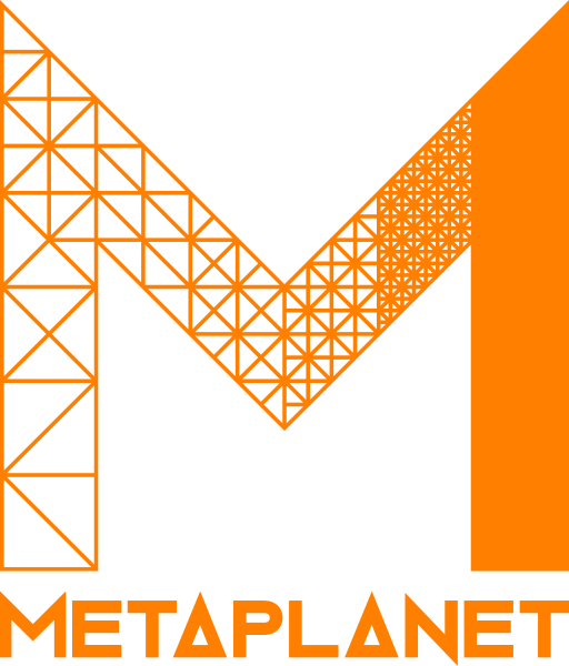
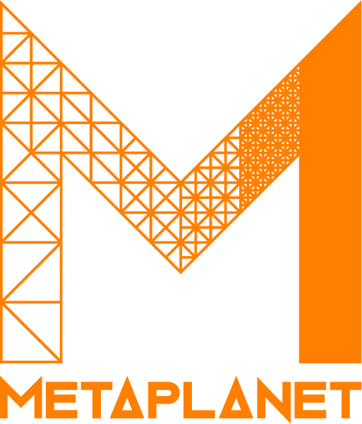
The horizontal wordmark is our most flexible lockup and suits the widest range of layouts. The orange wordmark is the preferred format, but use it only on black or white backgrounds. On dark, coloured, or image backgrounds use the white wordmark; on light backgrounds use the black wordmark.
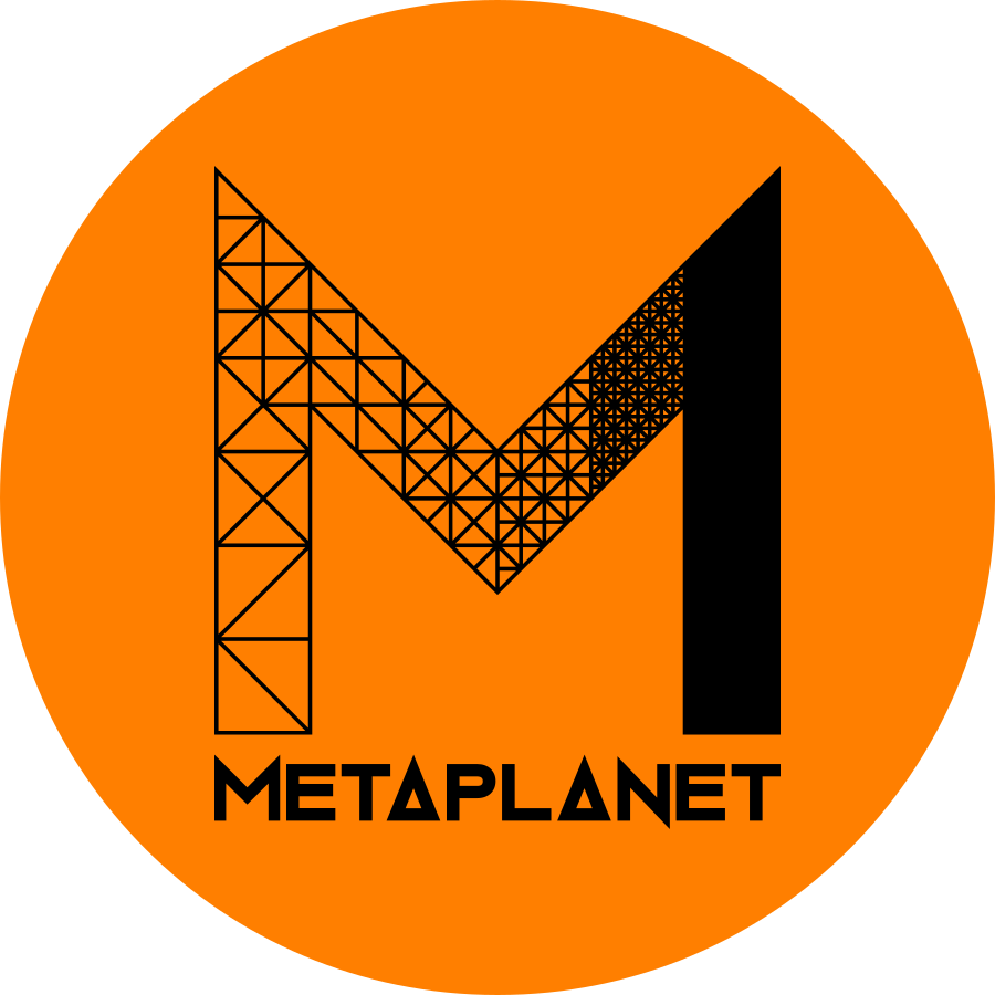
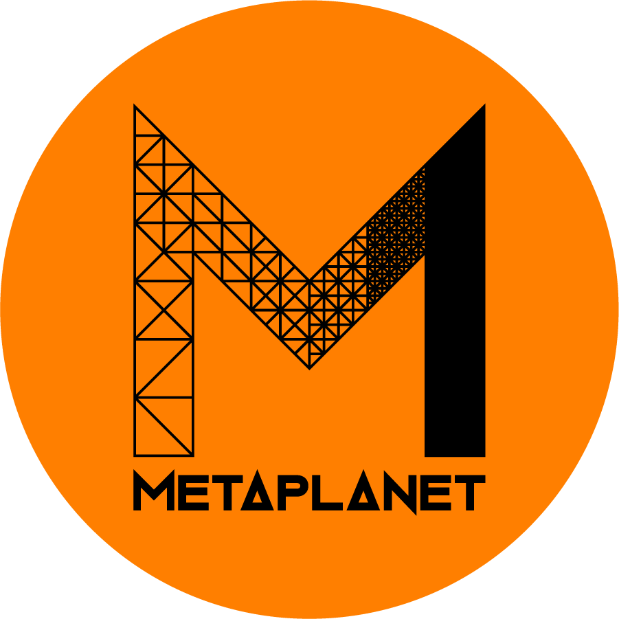
Our logo is the face of our brand, often the first thing people see, so it needs to make a strong and consistent impression. The Circle logo, black on Metaplanet Orange, is the preferred format.
Use the preferred black-on-orange format only on black or white backgrounds. On a coloured or image background, always use the plain White logo or Black logo instead, whichever reads more clearly.
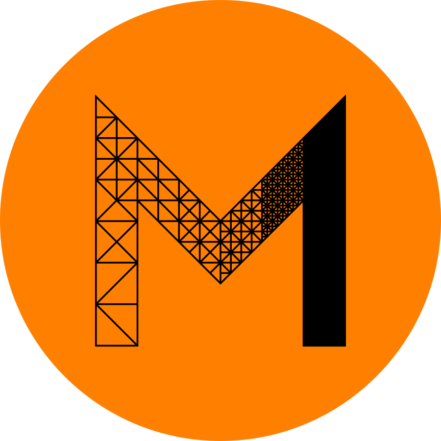
The icon is a simplified version of our logo for compact spaces like social profiles, favicons, and app icons. It follows the same rule as the logo: use the preferred black-on-orange Circle Icon only on black or white backgrounds, and the White or Black icon on coloured or image backgrounds, whichever reads more clearly.
Follow these rules to apply the logo consistently, every time.
Give the logos room to breathe, and never reproduce them so small they stop being legible. Clearspace keeps them free of competing elements; the minimum size keeps them readable.

X equals half the height of the logo. Keep at least X of clear space on every side, with no type, other logos, or busy imagery inside this zone.
Primary logo

Icon
Our primary colours are the most recognisable parts of our palette. Lead with them across brand materials to maintain a strong, consistent presence.
Metaplanet Orange
White
Black
Orbitron sets titles and headings, DM Sans carries body copy, and IBM Plex Mono handles small supporting text, alongside a dedicated Japanese face.
Orbitron
Titles & HeadingsOur title font reflects the core personality of the brand. Use it for titles and headings.
DM Sans
Primary / Body CopyOur primary typeface. Use it for body copy, key messaging, and anywhere clear, readable text is needed.
IBM Plex Mono
Small Copy & CaptionsOur supporting typeface. Use it for captions, data, labels, buttons, and small supporting copy.
Noto Sans JP
JapaneseOur primary Japanese typeface. Use it for all Japanese copy, including headings and body copy.
Metaplanet is Japan's first and largest listed Bitcoin treasury company. Our brand is the face of that conviction, so use these assets and rules to keep it clear, confident, and consistent everywhere it appears.
Style "Metaplanet" as a single word with a capitalised M, or in all caps. Do not split it into two words or capitalise the P. This is the rule people get wrong most often.
The horizontal wordmark is our most flexible lockup and suits the widest range of layouts. The orange wordmark is the preferred format, but use it only on black or white backgrounds. On dark, coloured, or image backgrounds use the white wordmark; on light backgrounds use the black wordmark.
Our logo is the face of our brand, often the first thing people see, so it needs to make a strong and consistent impression. The Circle logo, black on Metaplanet Orange, is the preferred format.
Use the preferred black-on-orange format only on black or white backgrounds. On a coloured or image background, always use the plain White logo or Black logo instead, whichever reads more clearly.
The icon is a simplified version of our logo for compact spaces like social profiles, favicons, and app icons. It follows the same rule as the logo: use the preferred black-on-orange Circle Icon only on black or white backgrounds, and the White or Black icon on coloured or image backgrounds, whichever reads more clearly.
Follow these rules to apply the logo consistently, every time.
Give the logos room to breathe, and never reproduce them so small they stop being legible. Clearspace keeps them free of competing elements; the minimum size keeps them readable.
X equals half the height of the logo. Keep at least X of clear space on every side, with no type, other logos, or busy imagery inside this zone.
Primary logo
Icon
Our primary colours are the most recognisable parts of our palette. Lead with them across brand materials to maintain a strong, consistent presence.
Metaplanet Orange
White
Black
Orbitron sets titles and headings, DM Sans carries body copy, and IBM Plex Mono handles small supporting text, alongside a dedicated Japanese face.
Orbitron
Titles & HeadingsOur title font reflects the core personality of the brand. Use it for titles and headings.
DM Sans
Primary / Body CopyOur primary typeface. Use it for body copy, key messaging, and anywhere clear, readable text is needed.
IBM Plex Mono
Small Copy & CaptionsOur supporting typeface. Use it for captions, data, labels, buttons, and small supporting copy.
Noto Sans JP
JapaneseOur primary Japanese typeface. Use it for all Japanese copy, including headings and body copy.